Ever landed on a webpage and felt an instant connection? That’s the magic of a well-optimized landing page!
But how do you ensure your landing page casts the same spell? It’s not just about pretty landing page design or catchy headlines. It’s about the value proposition, understanding the pain point of your potential customer, and addressing it effectively.
Imagine having a checklist that guides you step-by-step to create pages that not only look good but have a high conversion rate.
Dive in, and let’s unravel the ultimate landing page optimization checklist to making your landing pages irresistible and high-converting!
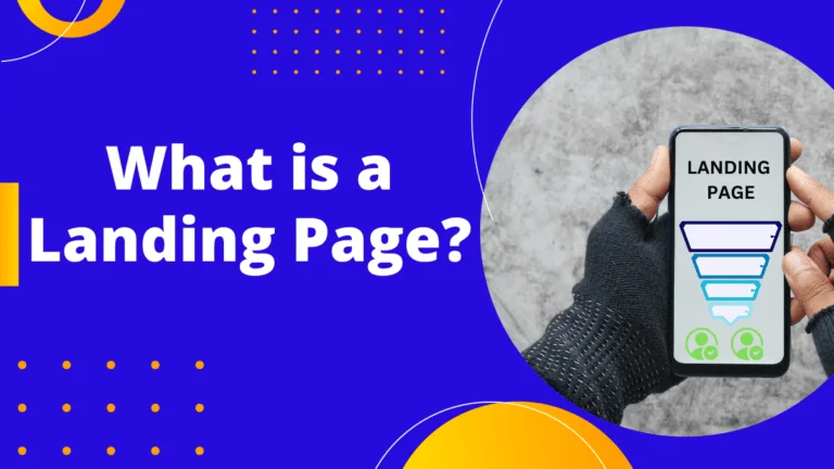
What is a landing page?
A landing page is a digital marketer’s best friend!
In the vast world of digital marketing, a landing page is a standalone web page crafted specifically for a marketing campaign. It’s the cornerstone of landing page optimization and a key component in best practice strategies.
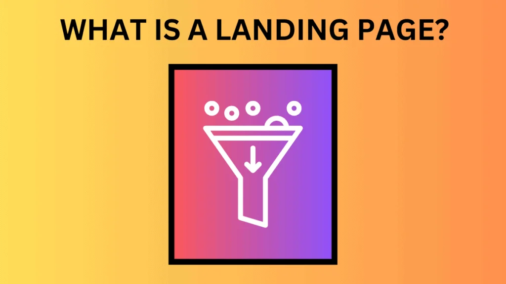
Think of it as the spot where a visitor “lands” after clicking on a link from an email, ad, or social media post. It’s the first impression, the landing page content that greets them.
Unlike regular web pages, which might encourage wandering with various objectives, a landing page has a laser-focused objective, often leading to a call to action or CTA. This singular focus, combined with landing page design best practices, is what makes landing pages a powerhouse for boosting the conversion rates of your marketing endeavors and ensuring a high-converting landing page experience.
Why is landing page optimization important? Why should you optimize your landing page?
Alright, fellow marketers, let’s dive deep! Ever wondered why landing page optimization is all the rage?
Well, a landing page is like the front door to your digital home. You want it to be welcoming, right?
But it’s not just about aesthetics.
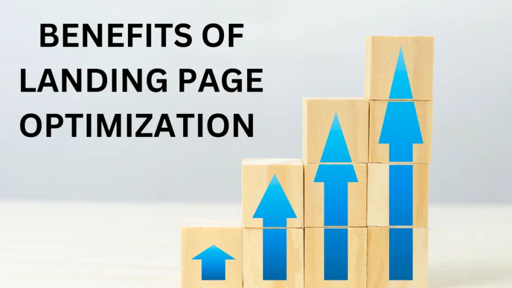
Landing page optimization is the secret sauce that ensures your visitors get the message loud and clear. Now, let’s break down the magic of optimization and see why it’s a game-changer:
- Clear Communication: A well-optimized landing page presents your potential customers with the right mix of relevant information, design, and functionality, ensuring they understand what you’re offering.
- Enhanced User Experience: It’s all about making sure your visitors have a seamless and delightful journey on your page. The better the user experience, the more likely they are to convert.
- Skyrocketing Conversion Rates: With the right tweaks and adjustments, you can achieve the highest possible conversion rate. It’s like turning your landing page into a conversion magnet!
- Cost Efficiency: By optimizing, you’re not just boosting conversions; you’re also reducing customer acquisition costs. Imagine getting more value with every marketing dollar spent.
A comprehensive landing page checklist will help you unlock all these benefits and make sure that your landing page is effective in achieving set goals. Be it affiliate marketing or promoting your own products, a well optimized landing page holds the key to your success.
So, if you’re looking to unlock the true potential of your marketing efforts and make every visitor count, it’s time to embrace the magic of optimization!
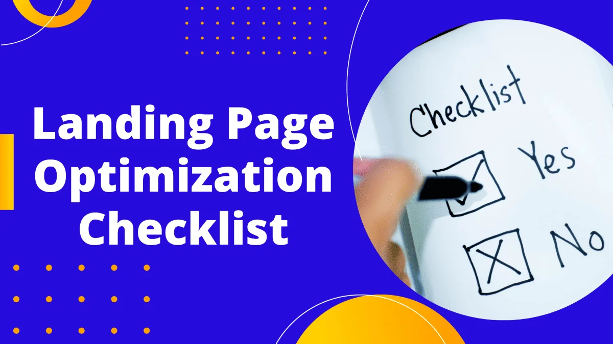
25 Point Landing Page Optimization Checklist For Higher Conversion Rate
So, we’ve established that landing page optimization is the key to unlocking the true potential of your marketing efforts. But, knowing its importance is just half the battle. The real magic happens when you roll up your sleeves and get to work! Ready to transform your landing page from a mere digital presence to a conversion powerhouse? Buckle up, because here’s the ultimate landing page checklist to guide you to create a high-converting landing page.
1. Value Proposition: The Heartbeat of Your Landing Page

Imagine walking into a party and someone asks, “So, what do you do?”
Your answer? That’s your value proposition in the real world.
It’s that quick, snappy summary that grabs attention and makes people want to know more.
On your landing page, it’s the same deal.
Your headline should be like that perfect party introduction: clear, compelling, and oh-so-relevant. It is the easiest thing on the landing page to fix.
Think of it as your page’s elevator pitch.
For instance, if you’re promoting a new eco-friendly water bottle, instead of just saying “Buy Our Bottle,” a catchy value proposition could be “Stay Hydrated, Stay Green: The Last Bottle You’ll Ever Need!” It speaks directly to eco-conscious consumers and highlights the unique selling point.
Remember, your value proposition is the first thing visitors see, so make it count!
2. Visual Brand Guidelines: Your Landing Page’s Wardrobe

Imagine showing up to a beach party in a tuxedo.
Out of place, right?
Similarly, your landing page needs to “dress” in a way that’s consistent with your brand’s identity.
It’s not just about looking good; it’s about feeling familiar and trustworthy to your visitors.
If your brand is all about minimalist design with a monochrome palette, your landing page shouldn’t suddenly explode with neon colors.
Let’s say you’re a company that sells artisanal, handcrafted chocolates. Your landing page could use earthy tones, elegant fonts, and images of chocolates being hand-painted. This not only showcases the product but also tells a story of craftsmanship and luxury.
Always remember: your landing page is an extension of your brand. Design your landing page to reflect your brand.
3. Copy: The Art of Persuasive Conversation
Think of your landing page copy as that charismatic friend who can effortlessly keep everyone engrossed in a story.
It’s not about using fancy words; it’s about connecting and convincing.
Your copy should be like a magnetic conversation that pulls visitors in.
For instance, if you’re selling a revolutionary sleep mask, instead of just stating, “Our mask helps you sleep better,” jazz it up a bit: “Tired of tossing and turning? Dive into a deep slumber with our game-changing sleep mask. Discover the secret to dream-filled nights!”
The goal? Make your visitors nod in agreement, feel the pain point, and get curious about the solution you’re offering.
Every word should serve a purpose, guiding them closer to that ‘Buy Now’ button.
Optimize your landing page by improving content on your page and increase your conversion rate.
4. CTAs: The Showstoppers of Your Landing Page

Imagine being at a concert, and the lead singer points the mic at the crowd, prompting everyone to sing along. That’s your CTA in the digital world – it’s the moment you ask your audience to join in.
Your CTA button is like the shining star on your landing page, guiding visitors towards the action you want them to take.
It shouldn’t just blend in; it should stand out!
If your page has a cool blue theme, consider a fiery orange for your CTA button.
And don’t just stick with the generic “Click Here.”
If you’re offering a free trial on affiliate marketing, your CTA could scream, “Unlock My Marketing Secrets Now!” It’s direct, exciting, and oh-so-tempting.
Remember, your CTA is the climax of your page’s story; make it unforgettable and you have a high converting landing page.
5. Images: Painting Your Landing Page’s Story
Ever heard the saying, “A picture is worth a thousand words”? In the digital realm, it’s more like a million!
Images are the visual ambassadors of your brand, giving life to your words and adding depth to your story.
Let’s say you’re promoting a yoga retreat. Instead of just talking about the serene environment, show a tranquil image of sunrise yoga by a calm lake. It instantly transports your visitors there, making them yearn for that experience.
But remember, consistency is key.
If your brand vibe is vintage and rustic, don’t suddenly throw in ultra-modern, glossy images. It’s like serving a pizza with a side of sushi – both delicious, but they don’t quite match.
Ensure your visuals not only captivate but also harmonize with your brand’s essence. This creates an effective landing page.
6. Functional Form: Your Digital Handshake
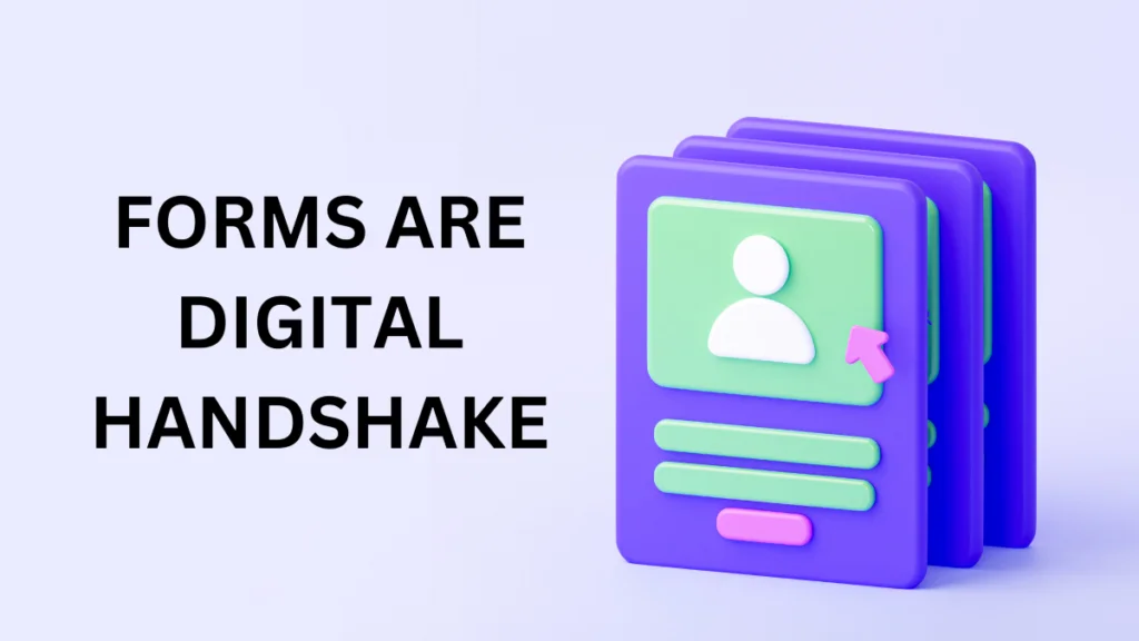
Imagine walking into a networking event. You meet someone interesting, and you exchange business cards. In the online world, your landing page form is that exchange.
It’s where visitors say, “Hey, I’m interested. Let’s connect!”
But here’s the catch: no one likes filling out long, tedious forms.
It’s like being stuck in a never-ending conversation with someone who just won’t get to the point.
If your landing page goal is to get newsletter sign-ups, maybe just ask for their name and email.
If it’s a product inquiry, a few more details might be necessary.
But always keep it concise.
A landing page without a functional form could result in tons of lost leads. So ensure your landing page content captures even a weak customer intent.
And hey, a little design flair doesn’t hurt! A sleek, user-friendly form not only looks professional but also encourages visitors to take that step and reach out. It’s your digital handshake, so make it firm and memorable!
7. Trust Indicators and Social Proof: Your Landing Page’s Seal of Approval
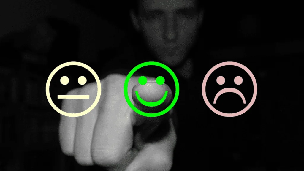
You know when you’re shopping online and you see those little stars or customer reviews?
It’s like having a friend whisper in your ear, “Hey, this product is awesome!”
That’s the magic of trust indicators and social proof.
In the vast digital ocean, they’re your lighthouses, guiding unsure visitors safely to your shores.
Let’s say you’ve got a revolutionary new skincare product. Instead of just saying it’s great, showcase testimonials like, “My skin has never felt better!” or “Visible results in just a week!” And those trust seals?
They’re like digital badges of honor, assuring visitors that their data is safe, and your business is legit.
Think of them as the reassuring hand on a visitor’s shoulder, saying, “You can trust us. We’ve got your back.”
In fact having good number of testimonials and proof of the effectiveness of your product or service can skyrocket your landing page conversion rate.
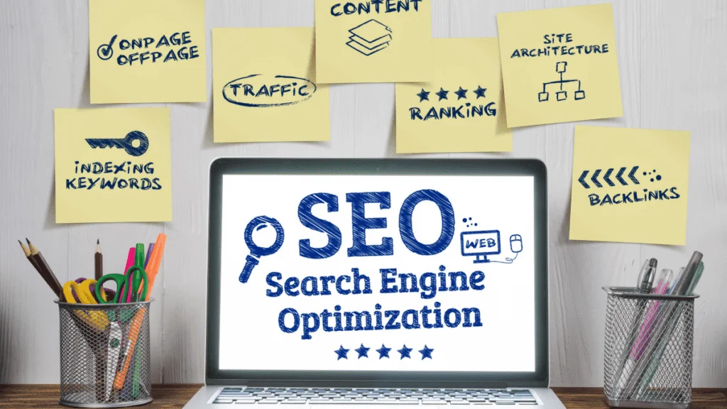
8. SEO: The Unsung Hero of Your Landing Page
Picture this: You’ve thrown an epic party, but you forgot to send out the invites. Well your landing page without SEO is like that party without guests.
Oops!
Even if you’re splurging on paid ads, you can’t ignore the power of organic search.
Think of SEO as the backstage crew at a concert. They might not be in the spotlight, but without them, the show doesn’t go on.
Start by sprinkling relevant keywords throughout your content.
If you’re selling handmade wooden furniture, terms like “artisanal,” “sustainable wood,” and “handcrafted designs” might be your best friends.
Don’t forget those meta elements – they’re like the sneak peek trailers that get people excited about your content.
And always, always ensure your content is search engine friendly. It’s like rolling out the red carpet for search engines, inviting them in, and saying, “Come on over, and bring all your friends (traffic) with you!”
You can use any of the popular SEO optimizer tools out there to help with this – Surfer SEO, Neuronwriter or SE Ranking.
9. User Experience: The VIP Treatment for Your Visitors

Imagine walking into a swanky hotel. The decor is stunning, but you can’t find the elevator, the signs are confusing, and the staff isn’t helpful.
Frustrating, right?
A landing page can be visually breathtaking, but if visitors feel like they’re in a maze, they’ll bounce faster than a rubber ball.
Landing page user experience is all about rolling out the VIP treatment for every visitor.
It’s ensuring that every element, from the headline to the CTA, guides them smoothly on their journey.
If you’re showcasing multiple products, use clear categories.
If you’re sharing information, break it up with engaging visuals and easy-to-read fonts.
Think of it as choreographing a dance, where every step, every move, is intuitive and delightful.
Because at the end of the day, a happy visitor is a returning visitor. This means drastically lower bounce rate.
10. The Evolution of Your Landing Page: Embracing Continuous Testing

Alright, let’s get real for a moment. You’ve poured your heart and soul into creating a good landing page.
But here’s a little secret: everything evolves.
What worked wonders today might be just “meh” tomorrow. That’s why you need to improve your landing pages continuously.
Consider Google Optimize, your trusty sidekick.
With A/B testing, you can play around – tweak a headline here, change an image there, or even shuffle the structure.
You can have different landing pages with slightly different headings, content, structure or CTA. It’s like having two cakes and figuring out which one gets more “Yums!” from your guests.
By testing different elements, you get insights, real golden nuggets, about what makes your visitors tick.
So, while your landing page might start as a caterpillar, with continuous testing, it’ll soon spread its wings as a butterfly, resonating beautifully with your audience.
11. Mobile Responsiveness: Rolling Out the Red Carpet for Pocket-Sized Visitors

Picture this: You’ve crafted the Mona Lisa of landing pages. It’s stunning, persuasive, and just downright fabulous on a desktop. But then, someone pulls it up on their smartphone, and bam! It looks like abstract art gone wrong. Yikes!
Enter the world of mobile responsiveness.
In an age where smartphones are practically glued to our hands, ensuring your landing page shines on these devices is non-negotiable.
It’s not just about shrinking things down; it’s about reimagining the experience for those on-the-go moments.
Whether someone’s browsing during their coffee break or while waiting for a bus, your landing page should be their perfect companion: easy to navigate, quick to load, and just as persuasive.
A couple of steps to perform to ensure mobile responsiveness of your landing page:
- Ensure that your page load time is very low. No one wants to wait around for a slow page.
- Use anyone of the free to use mobile readiness tests online to test your page. A few of them are – Google Mobile Friendly Test, Hubspot’s Website Grader, or Google Page Speed Insights.
12. Loading Speed: The Need for Digital Speed

Imagine you’re at a fancy restaurant, stomach rumbling, and you’ve been waiting forever for your meal. Frustrating, isn’t it? Now, translate that to the digital realm. Your landing page might be the juiciest steak in town, but if it takes forever to serve, visitors are going to walk out.
In the online world, every second counts. Literally. A delay of just a few seconds can make potential customers bid adieu. But fear not! By optimizing your page speed, you’re not just serving up content; you’re delivering a Michelin-star experience. Compress those images, streamline that code, and ensure everything loads at lightning speed. Because in the race to win hearts (and conversions), being the speedy hare, and not the sluggish tortoise, gets the gold. Use Google Page Speed Insights to check your page loading speed.
13. Clear Navigation: Your Landing Page’s Trusty Compass

Imagine setting off on a hiking trail without clear markers. You’d probably end up lost, frustrated, and wishing you’d stayed home. Similarly, when visitors land on your page, they’re looking for a clear path to follow. If they can’t find what they’re looking for quickly and easily, they might just turn back.
Your landing page might be packed with valuable content, but if it’s all over the place, it’s like a puzzle with missing pieces. You want to guide your visitors, step by step, ensuring they don’t miss any of the goodness you have to offer.
Actionable Steps for Clear Navigation:
- Intuitive Headers: Make sure your headers are descriptive and straightforward. If it’s about pricing, label it “Pricing.”
- Clickable Buttons: Ensure every button, whether it’s “Learn More” or “Contact Us,” is easily identifiable and clickable.
- Smooth Scroll: If your page is long, consider a smooth scroll function that lets visitors glide from one section to another effortlessly.
- Sticky Navigation Bar: If you have multiple sections, a sticky navigation bar at the top can be a game-changer. As visitors scroll, they always have access to the main sections.
- Highlight Active Sections: As visitors navigate, highlight the section they’re currently viewing. It helps them track their progress.
- Consistent Design: Keep the design of your navigation elements consistent. Same fonts, colors, and styles ensure a cohesive look and feel.
With these actionable steps, you’re not just presenting content; you’re offering a guided tour of your digital realm. And when visitors know the way, they’re more likely to stick around and explore.
14. Avoid Overwhelming Elements: The Art of Digital Minimalism

Picture this: You walk into a room filled with loud music, flashing lights, and a crowd of people talking all at once. Overwhelming, right? That’s how visitors feel when they land on a cluttered page. In the quest to provide information, it’s easy to go overboard. But sometimes, less is more.
A clean, simple design allows your key messages to shine. It’s like having a calm conversation in a quiet room, where every word is heard and understood. When visitors aren’t distracted by unnecessary bells and whistles, they can focus on what truly matters: your content and your call-to-action.
Actionable Steps to Avoid Overwhelming Elements:
- Prioritize Content: Decide what’s essential and what can be left out. Every piece of content should serve a purpose.
- Whitespace is Your Friend: Give your elements room to breathe. Whitespace can make your page look clean and organized.
- Limit Color Palette: Stick to a consistent color palette. Too many colors can be distracting.
- Use Clear Fonts: Choose readable fonts and maintain consistent sizes for headers and body text.
- Streamline Graphics: Use images and graphics that complement your content. Avoid using too many flashy or animated elements.
- Test with Real Users: Sometimes, what seems clear to you might be confusing for others. Get feedback and adjust accordingly.
Remember, in the digital world, clarity is king. A well-organized, clutter-free landing page not only looks professional but also ensures your visitors have a pleasant, stress-free experience.
15. Engaging Media: Bringing Your Landing Page to Life
Imagine visiting an art gallery. While paintings are beautiful, there’s something mesmerizing about interactive installations that invite you to be a part of the experience. That’s the power of engaging media on your landing page. Static images and text are great, but videos and interactive elements? They’re the showstoppers that can captivate your audience.
Whether it’s a video tutorial explaining how your product works or an interactive quiz that offers personalized recommendations, engaging media can make your visitors feel involved. It’s like giving them a front-row seat to the magic behind your brand.
Actionable Steps to Incorporate Engaging Media:
- Quality Over Quantity: It’s better to have one high-quality video than multiple mediocre ones. Invest in good production values.
- Keep It Relevant: Ensure that every piece of media, be it a video or an interactive slider, aligns with your product or service.
- Optimize for Load Time: Videos are great, but they can slow down your page. Compress them without compromising quality.
- Interactive Elements: Consider tools like quizzes, calculators, or interactive infographics that can provide value and engage the user.
- Mobile Optimization: Ensure that your media elements are optimized for mobile viewing. No one likes a video that doesn’t play on their smartphone.
- Clear CTAs: If you have a video, end with a clear call-to-action. Guide the viewer on what to do next.
By incorporating engaging media, you’re not just telling your brand’s story; you’re making your visitors a part of it. And when they’re involved, they’re more likely to be invested.
16. Consistent Branding: Crafting a Unified Digital Identity
Imagine meeting someone who changes their appearance and voice every time you see them. Confusing, right? That’s how visitors feel when they encounter inconsistent branding across your digital platforms. Your landing page isn’t just a standalone entity; it’s a chapter in the storybook of your brand.
Whether it’s the shade of blue you use or the font style for your headers, every element should scream ‘YOU.’ It’s these little details that make your brand recognizable and memorable. Think of iconic brands; you can spot them from a mile away, all thanks to their consistent branding.
Actionable Steps for Consistent Branding:
- Brand Guidelines: If you don’t have one, create a brand guideline. It’s your bible for colors, fonts, and logo usage.
- Logo Placement: Ensure your logo is prominently placed, but not overpowering. It should be the anchor, not the entire ship.
- Color Consistency: Stick to your brand colors. If your brand uses navy blue, that random bright turquoise button might not be the best idea.
- Font Familiarity: Use the same font families across your landing page. It creates a cohesive reading experience.
- Voice and Tone: It’s not just about visuals. Ensure the tone of your content aligns with your brand’s voice.
- Quality Check: Regularly review your landing page. Small inconsistencies can creep in over time. Be vigilant.
With consistent branding, you’re not just creating a landing page; you’re reinforcing your brand’s identity, making it stick in the minds of your visitors.
17. Privacy Assurance: Building Trust, One Data Point at a Time

Imagine handing over your diary to a stranger. Sounds risky, right? That’s how visitors feel when they share personal information online. In an era where data breaches make headlines, assuring your visitors that their data is safe with you is paramount.
Your landing page might have the most enticing offer, but if visitors have the slightest doubt about their data’s safety, they’ll hesitate. It’s like being at the edge of a diving board; they need that extra nudge of assurance to take the leap.
Actionable Steps for Privacy Assurance:
- Clear Messaging: Next to your form fields, include short, reassuring notes like “We value your privacy” or “Your data is safe with us.”
- Privacy Policy Link: Always have a link to your privacy policy nearby. It’s the rulebook that tells visitors exactly how their data will be used.
- Trust Seals: Consider adding trust seals from reputable security companies. It’s like having a security guard at the entrance, making everyone feel safe. Having such trust seals provides your page more credibility.
- SSL Certificate: Ensure your website has an SSL certificate. That little padlock in the browser bar? It’s a sign of a secure connection.
- Transparency: Be clear about why you’re collecting certain data. If you’re asking for a phone number, explain why.
- Opt-Out Option: Give visitors the option to opt out of certain data collections or newsletters. It gives them control and builds trust.
By offering privacy assurance, you’re not just collecting data; you’re building a foundation of trust. And in the digital world, trust is the currency that drives conversions.
18. Limit External Links: Keeping Your Visitors in the Room
Imagine hosting a party and constantly pointing out the cool events happening next door. Not the best strategy to keep your guests engaged, right? Similarly, on your landing page, every external link is like an exit sign, diverting visitors away from your main event.
Your landing page has a purpose, be it sales, sign-ups, or downloads. External links can distract visitors from that primary goal. It’s like giving them a map with too many detours, making it easy to stray from the path you’ve laid out.
Actionable Steps to Limit External Links:
- Audit Your Links: Review your landing page and identify all external links. Ask yourself if each one is absolutely necessary.
- Footer Placement: If you must include external links, consider placing them in the footer. It keeps them accessible but not immediately in the visitor’s line of sight.
- Use Pop-Ups: For essential information, consider using pop-ups or modals. This way, visitors get the info without leaving your page.
- Highlight Internal Links: If you have to link, prioritize internal links that keep visitors within your domain or funnel.
By limiting external links, you’re ensuring your visitors stay focused on the main event: your offer, message, or call-to-action.
19. Feedback Loop: Lending an Ear to Your Visitors
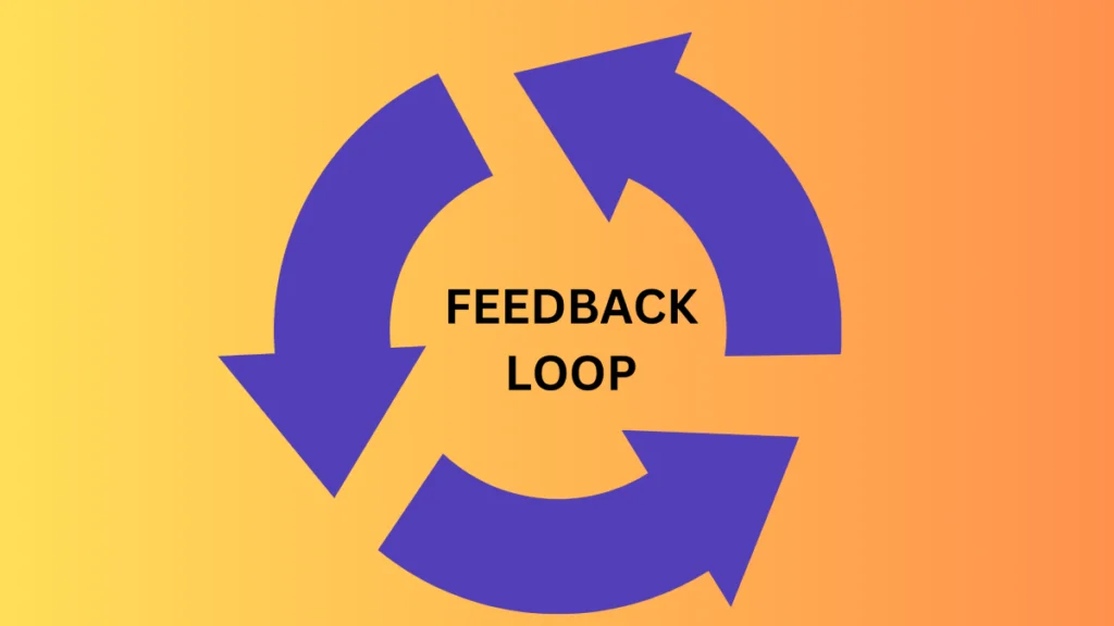
Imagine walking into a store, and every time you have a question, there’s no one around to help. Frustrating, right? In the digital realm, your landing page is that store, and a feedback loop is your ever-present, always-helpful store assistant.
Whether it’s a query about your product’s features or feedback about your website’s user experience, visitors appreciate a platform where they can voice their thoughts. It’s like opening a two-way communication channel, making them feel heard and valued.
Actionable Steps for Creating a Feedback Loop:
- Chatbots: Deploy a chatbot that can answer frequently asked questions in real-time. It’s like having a 24/7 customer service rep, always ready to assist.
- Feedback Forms: Consider adding a simple form where visitors can leave feedback or ask questions. Make sure to respond promptly to any queries.
- Highlight the Feature: Place your chatbot or feedback form in a noticeable spot, but ensure it doesn’t disrupt the user experience.
- Analyze & Implement: Regularly review the feedback and queries you receive. It’s a goldmine of insights that can help you refine your landing page.
By establishing a feedback loop, you’re not just answering queries; you’re building a relationship with your visitors, showing them that their opinions and concerns matter.
20. Clear Offer: Putting Your Best Deal Forward

Imagine walking past a store and seeing a sign that vaguely says, “Something’s on sale… maybe?” Confusing, right? In the digital marketplace, clarity is king. If you’ve got a killer deal, a fantastic discount, or an irresistible free trial, it shouldn’t be hidden in the fine print. It should be front and center, waving a flag, and shouting, “Hey, look at me!”
Your offer is the golden ticket that can turn a casual visitor into a loyal customer. But if they have to play detective to figure out what the deal is, you might lose them before they even get started.
Actionable Steps to Showcase a Clear Offer:
- Bold & Bright: Use bold fonts and contrasting colors to highlight your offer. Make it pop!
- Top of Your Page: Place your offer at the top of your landing page. First impressions matter, and you want to lead with your best foot forward.
- Simple Language: Avoid jargon. “30% off” is much clearer than “Tier 2 pricing activated!”
- Countdown Timers: If your offer is time-sensitive, consider adding a countdown timer. It creates a sense of urgency and creates a fear of missing out (FOMO) effect.
- Clear CTA: Pair your offer with a clear call-to-action. If it’s a discount, guide them to “Shop Now.” If it’s a free trial, invite them to “Try for Free.”
- Use Pop-ups: Repeat your offer multiple times on the landing page or as a pop-up specifically when user is about to leave the page. These are also called exit intent pop-ups.
By making your offer clear and prominent, you’re not just showcasing a deal; you’re rolling out a red carpet, inviting visitors to experience the best you have to offer.
21. Retargeting Pixels: The Digital Breadcrumbs for Future Engagements
Imagine you run a quaint little bookstore. A customer walks in, browses for a bit, picks up a book, seems interested, but then… they walk out without buying. Now, what if you had a magical way to remind them of that book as they sip coffee at a nearby cafe or stroll in the park? That’s the magic of retargeting pixels in the online world.
These tiny, unobtrusive pieces of code are like digital breadcrumbs. They allow you to “follow” your visitors (in a non-creepy way!) even after they leave your landing page. So, the next time they’re scrolling through their social media or browsing another site, you can gently remind them of what they left behind.
Actionable Steps for Using Retargeting Pixels:
- Choose a Platform: Whether it’s Facebook, Google, or another advertising platform, pick one that aligns with your target audience.
- Easy Integration: Most platforms offer simple ways to integrate their pixel into your landing page. Follow the guidelines.
- Segment Your Audience: Not all visitors are the same. Segment them based on their interactions, like “visited but didn’t sign up” or “added to cart but didn’t purchase.”
- Craft Tailored Ads: Design retargeting ads that speak directly to each segment. Remind them of the value or offer a special incentive to return.
- Monitor & Adjust: Keep an eye on your retargeting campaigns. Adjust based on performance and feedback.
By leveraging retargeting pixels, you’re not just hoping for a second chance; you’re actively creating opportunities to re-engage and convert those who showed initial interest.
22. Analytics Integration: Your Digital Crystal Ball for Insights

Imagine you’re a chef, whipping up dishes in your restaurant. You’d want to know which dishes are a hit and which ones diners push aside, right? In the digital dining room of your landing page, analytics tools like Google Analytics are your eyes and ears, giving you a play-by-play of what’s hot and what’s not.
By integrating analytics, you’re not just shooting in the dark; you’re making informed decisions based on real data. Which section do visitors spend the most time on? At what point do they drop off? Which call-to-action gets the most clicks? The answers to these questions are gold, helping you refine and optimize for even better results.
Actionable Steps for Analytics Integration:
- Pick Your Tool: While Google Analytics is a popular choice, there are other tools out there. Choose one that fits your needs.
- Seamless Integration: Most platforms offer easy ways to embed their tracking code into your landing page. Follow the step-by-step guides.
- Set Clear Goals: Define what you want to track. It could be page views, conversions, or specific button clicks.
- Regular Check-ins: Make it a habit to review your analytics dashboard regularly. The trends and insights will guide your next steps.
- Act on Insights: Noticed a dip in engagement in a particular section? Time to revisit and refine. Seeing a spike in traffic from a specific source? Consider focusing more marketing efforts there.
With analytics integration, you’re not just hoping your landing page performs well; you’re actively monitoring, learning, and iterating to ensure it’s the best version of itself.
23. Thank You Page: The Digital Pat on the Back and Guiding Hand

Imagine you’re at a store, and after making a purchase, the cashier just stares blankly without a word. Feels odd, right? In the online world, a ‘Thank You’ page plays the role of that friendly cashier who not only acknowledges your purchase but also guides you on what to do next.
A ‘Thank You’ page isn’t just a polite gesture; it’s a golden opportunity. It’s your chance to acknowledge the action your visitor took, whether it was signing up for a newsletter, making a purchase, or downloading an eBook. But why stop there? This page can also guide them on the next steps, offer additional resources, or even present a special offer.
Actionable Steps for a Stellar ‘Thank You’ Page:
- Personal Touch: Add a warm, personalized message. A simple “Thank you, [Name]!” can make a world of difference.
- Clear Next Steps: Guide your users on what to do next. If they’ve signed up for a webinar, provide the date and time details. If they’ve made a purchase, give them shipping information.
- Offer More Value: Consider adding links to related blog posts, videos, or other resources they might find useful.
- Gather Feedback: Use this opportunity to ask for feedback or a quick survey. It’s a great way to gather insights while the experience is still fresh in their minds.
- Stay Connected: Encourage them to follow you on social media or subscribe to your newsletter for updates.
By crafting a thoughtful ‘Thank You’ page, you’re not just acknowledging an action; you’re building a bridge, guiding visitors deeper into your brand’s universe.
24. Avoid Technical Jargon: Speaking the Universal Language of Clarity

Imagine sitting in a room where everyone’s speaking a language you barely understand.
You’d feel lost, right?
That’s how visitors feel when bombarded with technical jargon on a landing page. While you might be fluent in industry-speak, remember that your audience might range from experts to absolute beginners. The content of your landing page should be easy to understand.
Your landing page’s goal is to communicate, connect, and convert. If visitors are spending more time deciphering terms than understanding your offer, you’ve lost half the battle. It’s like trying to enjoy a song when you can’t understand the lyrics.
Actionable Steps to Keep It Clear:
- Simple Language: Write as if you’re explaining to a friend who’s new to the topic. If a term sounds too technical, find a simpler alternative.
- Glossaries & Tooltips: If you must use specific terms, consider adding a glossary or tooltips that offer quick explanations when hovered over.
- Visual Aids: Use diagrams, infographics, or animations to explain complex concepts. A picture is worth a thousand words, after all.
- Feedback Loop: Encourage feedback from diverse users. If multiple people point out that something’s confusing, it’s time to simplify.
- Stay Relatable: Use real-world analogies or examples to explain technical concepts. It makes the information more digestible and relatable.
By avoiding technical jargon, you’re not just making your landing page accessible; you’re ensuring that your message resonates loud and clear with everyone who visits.
25. Social Sharing Buttons: Turning Visitors into Brand Ambassadors

Imagine you’ve just discovered an amazing new cafe. Your first instinct? To tell your friends about it! That’s the power of word-of-mouth in the real world. In the digital realm, social sharing buttons play a similar role. They’re like giving your visitors a megaphone to shout out about your awesome landing page to their network.
By adding these buttons, you’re not just hoping for more visibility; you’re empowering your visitors to spread the word. It’s like lighting a beacon that attracts more and more people to your offer, all thanks to the initial visitors who loved what they saw.
Actionable Steps to Amplify with Social Sharing:
- Prominent Placement: Ensure your social sharing buttons are easily visible, but not intrusive. Consider placing them on the side or at the end of your content.
- Custom Messages: Allow users to customize the message they share. A personal touch can make their endorsement even more powerful.
- Track & Analyze: Monitor which platforms are getting the most shares. It can offer insights into where your target audience hangs out the most.
- Encourage Sharing: Sometimes, a gentle nudge is all it takes. Add a call-to-action like “Loved this? Share with your friends!”
- Optimized Imagery: Ensure that when your page is shared, the accompanying image and description are optimized and relevant.
By integrating social sharing buttons, you’re not just increasing your landing page’s reach; you’re building a community of brand ambassadors, ready to vouch for your value.
Conclusion
Alright, dear reader, as we wrap up, let’s remember the essence of our journey. Your landing page stands as a beacon in the vast digital landscape, beckoning visitors and promising value. And just like any promise, it’s crucial to deliver.
Landing page optimization isn’t merely an aesthetic endeavor. It’s about forging a seamless, engaging, and trust-building experience for every visitor. It’s the bridge between a fleeting click and a meaningful interaction.
From understanding the importance of a clear value proposition to harnessing the power of retargeting pixels, we’ve delved deep into the essentials of crafting an optimized landing page. Remember, in the digital realm, your landing page is often the first touchpoint for potential customers. And with the checklist we’ve explored, you’re now poised to make that initial interaction truly memorable.
As you set forth on this optimization journey, always prioritize your audience. Listen to their needs, adapt to their feedback, and consistently aim to offer an experience that not only meets but exceeds expectations.
Happy optimizing, and here’s to creating landing pages that resonate, engage, and convert!
Questions? We Have Answers.
Get answers to a list of the most Frequently Asked Questions.

![Make Money with Affiliate Marketing Without a Website [2023]](https://www.parulraj.com/wp-content/uploads/2023/09/Aff-Mkt-Without-website-feature-image-768x432.png.webp)